
来自索契冬奥会转播画面,应该是俄罗斯国家电视一频道+圣火的标志。
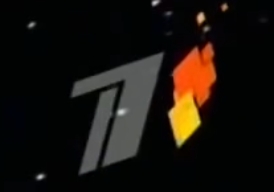
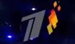
用HTML粗糙实现类似效果,如果要精准复刻,还是需要位置和动画的精细调整。
<style>
        /* 创建父容器来承载菱形,并设置其为 relative 定位 */
        .container {
            position: relative;
            width: 500px; /* 缩小容器的大小 */
            height: 500px; /* 缩小容器的大小 */
            display: flex;
            justify-content: center;
            align-items: center;
            overflow: visible; /* 防止容器遮挡菱形动画 */
        }

        /* 菱形样式 */
        .diamond {
            position: absolute; /* 使用绝对定位来控制每个菱形的具体位置 */
            width: 60px; /* 缩小菱形的宽度 */
            height: 90px; /* 缩小菱形的高度 */
            background-color: yellow; /* 初始颜色为黄色 */
            clip-path: polygon(50% 0%, 100% 50%, 50% 100%, 0% 50%); /* 菱形形状 */
            animation: growDiamond 0.5s ease-in-out forwards,
                      riseAndShrinkDiamond 1.5s ease-in infinite; /* 循环动画 */
            transform-origin: bottom center;
        }

        /* 菱形扩展动画 */
        @keyframes growDiamond {
            0% {
                transform: scaleY(0);
                opacity: 0;
            }
            100% {
                transform: scaleY(1);
                opacity: 1;
            }
        }

        /* 上升并缩小动画 */
        @keyframes riseAndShrinkDiamond {
            0% {
                transform: translateY(0) scale(1);
                opacity: 1;
                background-color: yellow;
            }
            100% {
                transform: translateY(-150px) scale(0.05); /* 缩小菱形的移动范围 */
                opacity: 0;
                background-color: red;
            }
        }

        /* 为每个菱形设置不同的初始位置、大小、延迟和动画 */
        .diamond:nth-child(1) {
            animation-delay: 0.2s;
            left: 50px; /* 自定义位置 */
            top: 50px;  /* 自定义位置 */
            transform: scale(1.2); /* 初始大小为1.2倍 */
        }

        .diamond:nth-child(2) {
            animation-delay: 0.4s;
            left: 60px;
            top: 70px;
            transform: scale(0.8); /* 初始大小为0.8倍 */
        }

        .diamond:nth-child(3) {
            animation-delay: 0.6s;
            left: 30px;
            top: 15px;
            transform: scale(1.5); /* 初始大小为1.5倍 */
        }

        .diamond:nth-child(4) {
            animation-delay: 0.8s;
            left: 40px;
            top: 20px;
            transform: scale(1);
        }
    </style>
</head>
<body>
    <div class="container">
        <div class="diamond"></div> <!-- 第一个菱形 -->
        <div class="diamond"></div> <!-- 第二个菱形 -->
        <div class="diamond"></div> <!-- 第三个菱形 -->
        <div class="diamond"></div> <!-- 第四个菱形 -->
    </div>
</body>
发表回复